COLOR!

Color. It's seldom thought about with any sort of great extent. Artists try to find the right way to use it. Homeowners fret over it. Designers charge for it and so on. As children we learn about red and blue and all the rest and they are so simple to us. Plants are green. The sky is blue and the sun is yellow. Color makes us feel comforted like a cool blue of water or afraid like the red of blood. We use it daily to describe our moods like green with envy or feeling blue.
(I started this at work 10/26/2010 because it's pretty slow. For those of you who are coworkers of mine and feel like getting me in trouble, my being on the computer all the time isn't so bad. I'm up front and greet customers as they enter the store and as soon as someone needs assistance I can minimize my window and help them. I do not keep my head down and purposely ignore people like a former employee, nor do I chat in the contractor section with my back turned or use my cell on the sales floor [except texts when there's nothing going on and I'm behind the register]. PLEASE DON'T FIRE ME!)
At work I frequently get asked to make a paint or stain color lighter/darker/redder/less red/browner, etc. One thing people don't understand is that adding ANY color not in the original formula, without adding the others, doesn't make it the same color, but making it darker/redder/less red/browner makes it A DIFFERENT COLOR. Adding blue to red doesn't automatically make it purple, but it is a bluer red, or a cooler red. So, I've decided to lay out a few color terms, as >>I<< understand them. I may be very wrong. I don't feel like seeing what Webster has to say right now.
DARKER: Darkness can be adding ANY darker color...black, brown, purple, blue, whatever. This is sometimes confused with OPACITY, which is the ability to see through the color.
Example: If I make black stain, it can't really go darker. It's already black, but I can make it at double and even triple strength, but then it is more pigmented and will hide whatever is underneath it more.
Example 2: If I make a paint color, if there is room in the can and the product tint levels allow (a product can only take so much pigment/colorant before its quality is compromised) I can add more of the SAME colorants to make it darker. If I add black, it will get DULLER. (Dulling a color can be done by adding black, gray, brown or a bit of the colors' chromatic opposite. Too much of any of those will make it muddy.)
LIGHTER: Lightness can be adding white or sometimes yellow. This is sometimes confused with TRANSPARENCY, which is the ability to see through a color and is the opposite of opacity. (It's like that old saying when someone is in your way "Hey so and so! You make a better door than a window!")
Example: If I make a black stain, I can add white, but the color is now gray and has MORE opacity. If I dilute the stain, it will still be black, but have LESS opacity.
Example 2: If I make a paint color, you can't really remove pigment/colorant to make it lighter. You also can't add white pigment/colorant because it will just get CREAMIER (or cloudier). The real way to make it lighter is to add more white base. (Most paint colors start as white base for light colors, a mid base and a accent/deep/neutral base for darker colors. Adding more accent/deep/neutral base may dilute the color, making it more TRANSPARENT, not lighter.) Something that we do is make the color at 25, 50, or 75% right when you order it, because less pigment = a lighter color (though again, this only works in white bases. If you do this is accent/deep/neutral bases, it will be more TRANSPARENT and more like glaze. You can make the accent/deep/neutral based color in white base, if the pigment will fit, and it will be lighter, but then it's also a MISS TINT and those are technically not supposed to happen.)
SHADE and TINT: Frequently I'll have a customer asked if I can make a color a shade lighter (see above) and a tint darker (also see above). This is really the opposite. (A similar thing would happen when I lived in Laguna Beach during art school. People would say "Go down to LA or go up to San Diego. LA was north and San Diego was south, so I caught myself correcting people.) A SHADE is when a color goes towards black (all colors mixed together in theory...though it's more of a really disgusting brown). A TINT is when a color goes towards white, which in regards to paint is the absence of color. (With light, the opposite is true: all colors mixed together make white. Take the colors away and you have darkness aka black. But don't even get me started on the science of light and the spectrum, but that is interesting stuff and I could ramble for hours.) This is different for inks, which rely on the white of the paper coming through (that's why we really don't like trying to match PANTONE or PMS colors. They don't seem bright enough in paint form.) Inks are a TRANSPARENT medium. Paint is an OPAQUE medium. This is a great image of a color wheel showing shades and tints, and a gray scale:

This one shows ANALOGOUS colors, which we'll discuss at length later:

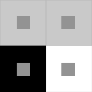
This image shows how the same gray looks different based on what's around it:
A side note: Not only do I work at a store that SELLS house paint and MANUFACTURES wood stains (another set of terms people get mixed up)...
I'm also an artist, who has worked with oil and acrylic paints, but prefers watercolor. Watercolor is similar to staining in a way because the intent is to save the color of the paper and let the white come through. Painting with oil or acrylic (or house paint) is ADDITIVE, meaning if you want white, you put it there. You generally don't want part of your canvas (house) left unpainted, because it makes the piece look incomplete.
Some terms designers like to use (but are usually just fancy words they use to impress their customers):
LUMINOSITY: This term usually refers to to the brightness of something and is *usually* a term used with light. Yellow is a 'bright' color (as in it is the opposite of dull) or the sun is very 'bright' (because a lot of light is entering your eye). The few times I do computer art, I like to use the 'luminosity' feature in the brush palette. It figures out for me the fastest way to white. A color that is 'luminous' possesses a lot of light.
TRANSLUCENCY: Something that is translucent allows light to pass through it, but is diffused, meaning it's foggy (like frosted glass).
 Not quite the scientific looking diagram I'd like, but I'll live.
REFLECTIVITY: The obvious answer is a mirror, chrome, windows from a certain angle, etc. The color aspect is that the color something is comes also from how our eye perceives it. Here's a nice image of the spectrum and 'visible' light:
 )
)Example: A red thing reflects the color red (from the spectrum of light) into our eye and that's how we see it. The red thing absorbs the other colors of light. A funny thing about red is that it's the first color to fade when it comes to paint, stain and inks, plus it's the first color to disappear when you go into a dark area or underwater. That's why many deep sea animals are red and why the only safe light in a photography dark room is red.
Another note: When it comes to color reflectivity and how our mind perceives color, it's interesting when you think about color blindness. We frequently have customers (almost always male customers) who mention "I need this color to match, oh by the way, I'm color blind." It makes you wonder why they need it matched since I have no idea how they are seeing what I'm seeing. A red tomato is still a red tomato, though to a red-green color blind person, does it just appear as shades of gray? (My boss wrote a bit about this in her blog some time ago).
An additional note: Reflectivity also has to do with sheen, IE: the higher the sheen, the more light it bounces around (and the more moisture resistant and washable it is as well). Customers as of late are anti-sheen, as in they seem to want the least amount of reflectivity that can be safely used in that particular room. But it can be helpful to brighten up dark spaces like basements and small rooms (like dorms). Shinier finishes are also generally harder and when it comes to clear coatings (polyurethanes, etc.) they have more clarity because there's less sheen paste or flattening agent.
VIBRANCY: Vibrant colors are bold, dramatic and are usually pure, meaning that they have no black or any of their chromatic opposites to dull the color. (See color wheels above.) Vibrancy also refers to the way colors react to each other, or the VIBRATION of the light wave length as it enters your eye. (Easiest way to see this to to take two very bright, opposing colors [blue and pink or red and green] and put them next to each other without a gap. If you look at them long enough, your eyes may start to 'hurt' and you may get a headache).

IRIDESCENCE: This is maybe my favorite color term, because it makes me think of beautiful things: Morpho butterfly wings, peacock feathers, chameleon paints and nail polishes. Iridescence is when a color is one thing from one angle, but may reflect different colors at other angles. We sell fabric (special order) and paints like that, where it might have a red base tone when looking at it straight on, but step to the side and it has a gold sheen.
PASTEL: Technically, a pastel color is a tint. It's a very very light color. (It also refers to a light tinting paint base and an artistic medium.) I don't really get how there is confusion, but there is.
NEUTRAL: This refers to being in the middle, undecided or maybe you just could care less...nihilist comes to mind. You're not good OR bad, you're not happy or sad, so on and so forth. In color, usual it means colorless, as in neutral tint base, meaning that the base itself does not impart color to the final product (though most neutral bases have SOME white in them so your paint will hide/cover). Neutral colors are SUPPOSED to be neither warm nor cool, not light or dark, not bright or dull. Just...in the middle. Designers like neutrals because they're safe and don't impart much personality (in my opinion). It's easier to spec. gray or sage green or beige or tan compared to black, grass green, brown or yellow.
WHITE: Believe it or not, white is tricky. White is the absence of color (or all colors as in light) but in paint colors, it's a mess! A customer who comes asking for white/base white/just white/plain white, etc. is easy. When a customer is looking for >>A<< white, well that's like opening Pandora's box. Creamy white? Gray white? Warm white? Cool white? Plus, there is NO standard base white. EVERY company has their own proprietary mix. In our paints, we have white base in two different brands, plus each brand has their own 'ceiling white'. Base white in oil paint is naturally a bit yellower. Some cheaper grades of paint have a grayer base. Shinier paints automatically look brighter than flat paints.
FULL SPECTRUM: Another term that is popular in design circles. When I was in art school, I was told to never use black in my paintings, because it dulls the colors. To this day, I seldom use black in my watercolor paintings because it's kinda true. It flattens shadows and can distract your eye. (I much prefer Payne's Gray which has a blueish cast and when barely diluted, looks practically black.) Full spectrum can mean two things: it uses ALL the colors (a VERY complicated feat) or no black. Not using black in a paint color is really easy. Using a bit of EVERY color is much more complicated because you need to worry about the color possibly going muddy in one way or another, plus you have to make sure they are in repeatable increments, like a formula.
Example: A warm yellow in one of our paint brands has 14.312/48ths of an ounce of yellow oxide (brand specific universal colorant [UNIVERSAL referring to 'dilutes in any medium', verses 'all brands of paint using the same colorant']), 0.063/48ths of an ounce of violet and 0.625/48ths of an ounce of orange in a sample pint (16 ounces) of paint. Our tint machine can't dispense less that 0.1/48ths of an ounce, so since the violet can't dispense, the simple pint of the color you bought will look different than the gallon. (In this instance, the warm yellow has violet in it to dull it slightly.) The gallon has 2 ounces and 18.5/48ths of an ounce of yellow oxide 0.5/48ths of an ounce of violet and 5/48ths of an ounce of orange in a gallon. Obviously the formula was created for the gallon, most likely without consideration for the sample formula (instead of creating the sample formulation first). (Another thing is doing the math [a pint is 1/8th of a gallon] there would be 5.04/48ths of the violet and 2 ounces and 18.496/48ths of the yellow, so the gallon would look slightly off anyways.)
Now since most of the color terms that get *confused* are covered, I'll go into color theory a bit more.
PRIMARY: Everyone who went through elementary school knows primary colors are red, blue and yellow. (Primary colors for light are red, blue and green. Magenta, cyan and yellow are printers' colors.) SECONDARY colors are green, purple and orange and are a combination of equal parts of the above. TERTIARY colors are made by mixing the two above sets. (See color wheel diagram above).
HOMOLOGOUS: This is one of my favorite terms. Homo is Greek for 'same' (and also Latin for 'man') and has to do with things that are similar. In scientific terms it refers to structures that evolved from different parts of the body, but do a similar thing, like our hand and an elephant's trunk. In color it has to do with the relation of the color wheel, like purple, blue and green.
ANALOGOUS: This is basically the opposite of above. In scientific terms it refers to structures that evolved form the same part of the body, but do different things, like our hand and a bat's wing.

In color it has to do with being unrelated, like purple and blue verses yellow and orange. (Looking at a lot of my art, these four colors in particular find their way into many of my pieces.) This is also commonly referred to as being CHROMATIC OPPOSITES. (Yellow vs. purple, orange vs. blue, red vs. green) These colors when used in the right way can make for a great color scheme (the University of Washington Huskies are purple and gold for instance. Red and green are holiday colors.)
Example: Not that I know ANYTHING about interior design, but a common color combination I really like is the warm orangey-red of clear, aged Fir trim and sage or other muted yellowy-green wall color. I've also seen an image of a kitchen or bathroom with a light aqua blue with warm yellow accents. Very pleasant and super retro.
SATURATION: Basically brightness. The more saturated a color is, the more intense it is. The less saturated a color is, the closer it is to a shade of gray (also called 'muted').
HUE: Similar to a certain color. When I was a freshman in art school, our teachers gave us a HUGE list of all the supplies we HAD to get for class. (A third I probably never used and a third of what I used then do I still use now.) One of the things we learned is that if we bought Cadmium Red, it was really costly. If we bought Cadmium Red HUE it looked basically the same, but was cheaper since it was a synthetic combination of ingredients, verses the real pigments.
I'd written a lot more, but forgot to save it and went to lunch. My manager closed it and so I was so bummed, I didn't feel like trying to remember and retype it all.
One thing I do recall has to do with color perception. No two people will see the same color the same way. I see customers wanting to stain their floors dark dark dark and I think of dreary gothy homes full of depressed people. Or a customer will have an idea in their head and will be at a loss to describe it, IE: "it's a lot like this but grayer...no, not that gray, maybe a bit more green" and so on. The worst thing you can EVER do when you come to a paint store is not have a sample or chip. I *suppose* a picture on a laptop or iphone or printout or magazine is better than nothing, but the different lighting conditions of how and where the image was taken, notheless how it is displayed will dramatically change how to color is seen.
Best idea is to do your research, call ahead and provide real, tactile visual samples.
(More to come....
NATURAL COLOR
OFF-WHITES
COLORS IN COMPARISON)
Just my two cents.
Here are some links to stuff about color:
The Meaning of Color
Color optical illusions
Color and perception
Super nerdy color site
posted by Rummy the tuxey kitty! at 9:26 PM
![]()

1 Comments:
Gah......color and design class flashbacks are haunting me now. Thanks alot, Rummy. ;)
Post a Comment
<< Home